Saturday, 23 February 2013
Evaluation Question 7
My school magazine and music magazine have a huge difference between them except for the fact that they are both holiday themed. My music magazine looks so much more professional than my school magazine which looks simple and basic.
I spent a lot more time planning my time management for my music magazine as I had issue's with this during my preliminary task. I put more time and effort into research and found that it definitely payed off. When creating my school magazine I was new too adobe indesign and therefore took a while to learn how everything worked, having known all this in my music magazine task I was able to get straight onto constructing and editing. I learnt more about magazine conventions and was able to use this is my Music magazine to make it as best as possible. I payed more attention to mise en scene as I realised this was extremely important & I allocated time to think solely about it.
My contents page also looks a lot more professional, I have not left a lot of blank white space in my music magazine and have made my contents look much more interesting and inviting. In my preliminary task I didnt even consider what order things would go in and why where-as for my music magazine I created a flatplan and then created my contents.
From researching, planning, creating and evaluating my magazines I have learnt that there is so much more to making a magazine than you originally might think. I learnt things like Country weekly is produced by American Media, Inc the same company that produces OK! & each magazine has a flatplan made of the order the magazine will be set. Before starting these tasks I would just look at a magazine and not really consider the reason I wanted to buy it, I knew nothing of the 'Z Rule' or the reasons things were placed where they were.
Creating the double page spread taught me that so much goes into just two pages of a magazine and the time it can take to plan and create these two pages. The photoshoot for my DPS was much more serious and professional than my photoshoot for my preliminary task.
I have really enjoyed making both my magazines and have spent a lot of time and effort making decisions, editing and creating. I have learnt lots of new skills and ideas that can be used in other aspects of school and life.
Friday, 22 February 2013
Evaluation Question 4
Who would be the audience for your media product?

Name: Payton Rae
Age: 17
Occupation: School/ Singer
Lives: London, England
Siblings: Older brother also a Country fan
Favourite Colour: Pink & blue
Favourite genre of music: Country
Hobbies: Horse riding, guitar playing, singing
Favourite Artist: Carrie Underwood
Thursday, 21 February 2013
Audience Feedback
This is the audience feedback from my final magazine:
Front Cover -
Try our slideshow maker at Animoto.
Contents -
Audience Feedback by beckadavis1 on GoAnimate
Video Maker - Powered by GoAnimate.
DPS -

.JPG)
.JPG)
.JPG)
.JPG)
Front Cover -
Try our slideshow maker at Animoto.
Contents -
Audience Feedback by beckadavis1 on GoAnimate
Video Maker - Powered by GoAnimate.
DPS -

.JPG)
.JPG)
.JPG)
.JPG)
Final DPS

This is my final double page spread.I got more feedback from the same people who gave feedback on my last DPS and this is what they had to say:
Female,18: I prefer this so much more than the last copy you showed me as I find that the layout is so much more interesting for me to look at and the background looks so much better without being too boring and plain white.
Male, 25: A huge improvement on the background and I personally love the quotes; these stand out more to me now due to the background change. The article is fantastic and would keep me very interested. The pink background colour doesn't put me off the article because I am a guy but you could maybe consider changing it to colour suitable to both genders.
I considered changing the background colour however I found that the Country genre was slightly more popular with the female gender and I didn't want to waste time constantly changing my mind. I felt like I should now 100% be focusing on my evaluation.
Monday, 18 February 2013
Change Of Mind

Female, 18: This doesnt seem to fit in with the rest of the magazine, the text is too close to both edges & there are no page numbers. However I do like the pictures used and the interview itself is very interesting.
Male, 25: I'm not overally keen on the background, I feel like their is so much more you could do with this.
Due to this feedback I am currently working on my new DPS.
Contents Page

I have used the same font as the front page to keep a consistent layout throughout my magazine. This is important because it shows professionalism and keeps the magazine from looking a mess.
I have used all of the colours from my most popular colour swatch on this page as I believe that they all go well together and make the page look interesting and each colour attracts attention to each part of the page with different information on. For example the light blue draws your eyes to the Chance to Win section and the Pink colour draws attention to the page numbers and information as to whats on each page. All these colours are linked closely with the Country genre so should be a hit with my audience like they were with my questionnaire audience.
I chose to include images on my Contents page because many Country magazines have also done so. I also believe that images will make the reader more interested into what some of the articles are about therefore making them want to buy and read the whole magazine.
I am happy with this final product because I feel that it gives off a Country impression and draws readers into wanting to buy & read the rest of the magazine.
Thursday, 31 January 2013
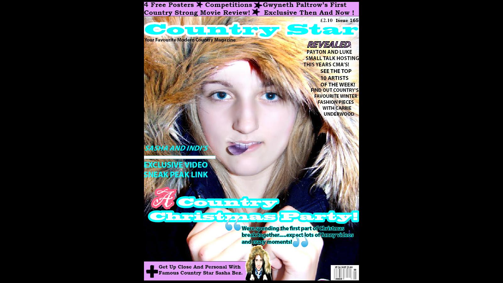
Final Front Cover And Comments

- Masthead - I chose the name Country Star because I felt that it gave a great impression of what my magazine was about. Country = country magazine, country music, country artists Star = Great stars of country music, shining above, great, artists that are upcoming and shining in the industry at the moment. I also chose this name because it was most popular on my questionnaire. The colour pink was chosen because it topped on my poll and questionnaire. It also stands out very well making the magazine eye catching and noticeable.
- Skyline - I chose to have a skyline because from my research I learnt that most Country Music magazine have one. The light purple colour was also part of the swatch that topped the poll and questionnaire. I have included in my skyline what the magazine has to offer, this will make the audience want to take advantage of the offers and deals and make them want to see inside the rest of the magazine. I have used words such as 'Free' and 'Exclusive' because these are words that would get people interested and locked onto my magazine.
- Slogan - I have included a slogan in the top left of my magazine to reveal what type of magazine it was and to get people convinced that this is what they wanted to buy. I have used the word 'Your' to make it more personal.
- Anchorage Text - The text explains the winter hood and the guitar plectrum. The plectrum and the hood contrast slightly but I like this as it shows the Winter/Christmas part of the DPS and the Country part of the DPS and the magazine as a whole.
- Price - I have placed the price on the top right of the magazine as I believe this is a reasonable price for my magazine. According the 'z rule' this would be around the second place the eyes look when picking up the magazine, hopefully the audience will see what a great price it is for the magazine quality the would be getting.
- Main Image - Represents who the main part of the magazine is focused on and what is inside the magazine. This image is a direct, eye level shot.
- Barcode - The barcode is placed in the bottom right hand corner because according to the 'Z rule' this is the last place the eyes will look. The barcode is important to have on there so the magazine can be bought but it has no importance to the actual magazine.
- Sell Lines - I have included sell lines on my front cover to give insight as to what is inside my magazine, this will help the audience decide on whether this is what they would like to read.
- Puff - My puff is located in the bottom left hand corner but still stands out and provides an insight to an article inside of the magazine. Most puffs are usually shaped in a star or circle however I chose mine as a rectangle as you can occasionally find these on a Country Magazine and I feel it shows the modernness of the magazine.
The layout of my magazine I feel is good because it is not to overcrowded and busy. It follows the 'Z Rule' as to draw attention to what the magazine is about and a cheap price and leave un interesting parts such as the barcode to the very last place the eye will see, which is the very bottom right.
Mise En Scene;
Connotations-
I chose the fonts because of how they connote. I made the 'A' a different font from the rest of the Anchorage Text to make it stand out and look more interesting. This connotes that the inside of my magazine will be fun and interesting and not just plain and boring.Mise En Scene;
- The brightness of the lighting connotes that the magazine is fun, modern and up to date. This will tell the audience that the inside of the magazine is not plain or boring and will keep them interested.
- My model is wearing a winter coat to connote the winter themed photoshoot she has taken part in. The plectrum in her mouth connotes the Country genre side of the photo and shows her interest in guitars.
- The make up of the model is very natural connoting that she is a very natural person and very down to earth. The hairstyle can only be seen a little but it is clear that the hair is straight and coloured blonde. From my research I learnt that this is typical to a Country Star. The coat worn by the model shows that it is set in a current modern time period.
- The hood around the model connotes winter and links in with the winter theme.
- The plectrum in the mouth of the model connotes Country and links to guitars which are a huge part in the Country genre.
- The pinky/red colour connotes Country also as from my research I found that this colour is very well associated with this genre.
- The font connotes a laid back interesting type of magazine because it is not too in your face or unusual.
Feed Back:
Female, 18; For me, the front cover looks very professional. I really like
the colour scheme, main image and the use of a quote. I also like how the
bullet points at the top of the page are stars as it links back to the title.
Personally, I think that the font on the ‘A’ for ‘A Country Christmas Party’
should be the same as the rest of the text. However, if it is designed to
emphasise the word I think that ‘Christmas’ would be more appropriate. I really
like the advert section at the bottom of the page using a plus sign and image.
Although, I think the smaller image of the singer should be different to the
main image. In doing this, it would make the section more appealing and
eye-catching.
Male, 22; I think the front cover of this magazine looks very proffesional, I paticularly like the way the 'A' is seperate from the rest of the title because it makes it stand out and look nice. I also think the speech marks are a great idea because it makes the quote stand out. The bar at the top of the page is very helpful because it tells me whats inside and makes me more interested in the magazine. A suggestion I would make to improve it would be to maybe add a logo where people would know what magazine it is without a name.
Saturday, 26 January 2013
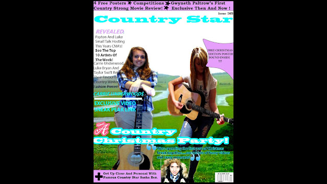
Front Cover
I have made some drastic changes to my magazine front cover. I decided I wasnt happy with the quality of the front cover photo and the whole feel of the magazine overall. I want my magazine to be known as an up to date modern country magazine with the latest and greatest news but I didn't feel that my old magazine cover connoted that. This is my new magazine front cover;
 I changed the front photo to another one which I felt was much better quality and more direct, both of these things mean that the audience would be more enticed towards my magazine.
It still has all the key features of a music magazine:
It still has all the key features of a music magazine:
- Masthead - I chose the name Country Star because I felt that it gave a great impression of what my magazine was about. Country = country magazine, country music, country artists Star = Great stars of country music, shining above, great, artists that are upcoming and shining in the industry at the moment. I also chose this name because it was most popular on my questionnaire. The colour blue was chosen because it topped on my poll and questionnaire. It also stands out very well making the magazine eye catching and noticeable.
- Skyline - I chose to have a skyline because from my research I learnt that most Country Music magazine have one. The light purple colour was also part of the swatch that topped the poll and questionnaire. I have included in my skyline what the magazine has to offer, this will make the audience want to take advantage of the offers and deals and make them want to see inside the rest of the magazine. I have used words such as 'Free' and 'Exclusive' because these are words that would get people interested and locked onto my magazine.
- Slogan - I have included a slogan in the top left of my magazine to reveal what type of magazine it was and to get people convinced that this is what they wanted to buy. I have used the word 'Your' to make it more personal.
- Anchorage Text - The text explains the winter hood and the guitar plectrum. The plectrum and the hood contrast slightly but I like this as it shows the Winter/Christmas part of the DPS and the Country part of the DPS and the magazine as a whole.
- Price - I have placed the price on the top right of the magazine as I believe this is a reasonable price for my magazine. According the 'z rule' this would be around the second place the eyes look when picking up the magazine, hopefully the audience will see what a great price it is for the magazine quality the would be getting.
- Main Image - Represents who the main part of the magazine is focused on and what is inside the magazine.
- Barcode - The barcode is placed in the bottom right hand corner because according to the 'Z rule' this is the last place the eyes will look. The barcode is important to have on there so the magazine can be bought but it has no importance to the actual magazine.
- Sell Lines - I have included sell lines on my front cover to give insight as to what is inside my magazine, this will help the audience decide on whether this is what they would like to read.
- Puff - My puff is located in the bottom left hand corner but still stands out and provides an insight to an article inside of the magazine. Most puffs are usually shaped in a star or circle however I chose mine as a rectangle as you can occasionally find these on a Country Magazine and I feel it shows the moderness of the magazine.
The layout of my magazine I feel is good because it is not to overcrowded and busy.
Friday, 25 January 2013
Front Cover
This post will show the steps I went through to making my final magazine:
 1. This is the first step that I took in making my front cover. I chose this as my background image because I after taking feedback onboard that having a background was so much more interesting for the audience than a plain white background. It also was more like the general country magazines this way. I chose the photo it self because it is a typical outdoors country layout that will appeal well to my target audience.
 2. The next step I took was placing the skyline on the top of the page. I placed in the skyline special offers and attention grabbers such as 'free posters' to entice people to buy my magazine and want to read further inside. I also added the Masthead of my magazine because I had 100% decided on my magazine name from personal liking and results of my questionnaire and I knew what I wanted it to look like. I chose the colour blue because it was a popular choice in my questionnaire and poll. I placed where I wanted there to be text and left this subject to change.
 3. I chose to keep the text boxes in the same place because I liked the look of the layout this way.I then proceeded to add on where I wanted to place my anchorage text & quote text.
 4. I then continued to add to my layout. I added some more sell lines and two spaces for images.
 5. I then completed filling in my sell lines, anchorage text and images. I also added a puff to promote a free poster inside the magazine. I placed the puff in the top right because this is one of the first places your eyes look on a magazine according to the 'z rule' I then placed my barcode and price in the bottom right corner because this is the last place your eyes look according to the 'z rule'. I wanted people to have already made up their mind about buying my magazine before seeing the price.
 6. I brightened up my background added my artists to my front cover to draw interest and make people want to see inside the magazine to see what their favorite artists have to say.
 7. This is my finished version of my front cover. I have included all the main magazine conventions:


- A masthead
- Skyline
- Slogan
- Anchorage Text
- Price
- Main Image
- Bar Code
- Sell Lines
- Puff
- Colour Scheme
I have also included a colour swatch that was voted most popular on my magazine questionnaire and poll. I chose it for this reason because I then know that it is a colour scheme that my audience would like. I found my target audience to be both male and female gender aged 14+ going up to around 40 years old. I feel the colours in my colour swatch provide something for everyone.
The layout of my magazine I feel is professional and not too overcrowded. Everything can be seen clearly and is located in places that will catch the eye according to the 'z rule'.
One problem I have encountered is that my images appear slightly blurry after uploading them so I hope to find a way to fix this.
I had considered other images such as this one:

The layout of my magazine I feel is professional and not too overcrowded. Everything can be seen clearly and is located in places that will catch the eye according to the 'z rule'.
One problem I have encountered is that my images appear slightly blurry after uploading them so I hope to find a way to fix this.

I decided not to use this because the artists weren't direct therefore not engaging with the audience.
Thursday, 24 January 2013
Media Photography Video Evidence

All Photo's Taken And Edited
I chose to edit these photo's because I thought these were the best selection out of the photo's I have taken so far. I want to try and take some in an outdoor location but due to timing, weather and
 I like this photo because the facial expressions shows the two stars are comfortable in each others presence and are having a good time. The camera shot/angle is very direct and is a good eye shot.
  I have decided not to include this is in my magazine because I felt it the effect didn't stand out and entice people and it doesn't really link to anything in my magazine.
  I like this photo because it links in with the Christmas edition of my magazine and is a good full shot. However the editing didnt really go to plan and in some places such as the right models right leg you can clearly see it messed up. So I will be trying to reedit the photo and not use this one.
 I like this photo because the guitar prop links in well with the Country theme. This is a low angle full length shot. The outfit is clearly shown and is also part of the Country theme as the chinos and especially the checkered top are very popular in this genre. The body language is also very relaxed and casual which will appeal to the target audience.
 I like this photo because it is a midshot and is very focused on the particular artist. It is taken from an eye level angle giving the readers/audience to see exactly how the photographer and other people see the artist. This is something that would entice them to look further. The checkered shirt is also clearly featured in this photo.
  This photo is one of my favorites because it is very different from the rest. The photo is taken from a high angle and is a midshot.
  I like this photo because it shows a very natural side to an artist who is very in touch with there job. This is an eye level shot and an indirect photo. The body language is this photo is very tight and confined almost as if singing is a part of her and is a very personal thing.
  This is a very upclose and personal photo taken at an eye level angle and is a close up shot. This is a great profile shot for the artist. The facial expression shows the artist to be happy and relaxed which will give off a good image of the magazine itself. This is a direct shot.
  This is another great profile shot of the artist taken for an eye level angle and a close up shot. The facial expression shows that the artist is happy, relaxed and having a good time. This is a non-direct shot.
  The outfit and props in this shot heavily connote the Country genre. The ripped jeans and guitar are particularly popular within this genre. You can see that the artist is in her own world with the music in this photo and is very much concentrated on playing the guitar. This is a full length body shot and is taken from a slightly high angle shot.
 This shot and the one below are great photo's because their facial expressions connote fun and a good time which is the impression they want the audience to have of them. The stocking on top of their heads connote the Christmas theme. The top photo is a non direct close up shot taken from eye level. The bottom photo is a direct mid shot taken also from an eye level.
 This is a high angle non direct shot. The two artists are facing eachother with happy facial expressions, this connotes that they are happy to be in eachothers presence and there low shoulders show that they are relaxed and not tense or nervous. I have tried to edit the background green but it didn't turn out as well as I hoped that it would.
  This is a direct eye level close up shot. The guitar pick placed in the mouth connotes the artist plays the guitar and it is a part of who she is as a person. The furry hood around the edge connotes the winter feel to the magazine.
  This is a direct eye level medium close up shot. The furry hood again connotes the winter feel and the checkered shirt again links to the Country genre theme.
  This is a non direct shot taken as though the artists didn't know the photo was being taken. Their natural body language and facial expressions connote they were unaware of the photo being taken. The body language of the right artist compared to the left artist shows that the right artist was most likely teaching the left artist how to play the guitar. You can tell this by looking at the hands of both artists.
 Wednesday, 23 January 2013
DPS


I have already changed my mind a few times about the layout and have not really stuck to my original plan.

Tuesday, 22 January 2013
DPS Article
I have almost completed my DPS article interview with my two main cover stars. A few of the questions I have asked are:

- How are you coping with the fame?
- What advice have you given and would you give to young artists waiting for their big break?
- Relationship Status' ?
A few quotes from my interview answers:

Writing the interview was much harder than I expected and I am glad I allocated a good amount of time to work on it because it involved a lot of thinking and re-editing. Trying to get my answers to sound as genuine and true as possible was hard so I looked back through all my previous research and looked at the sort of questions generally asked in Country magazines, this really helped give me inspiration.
Video Evidence
I am currently in the process of editing my video evidence completing my front cover and working on my contents and double page spread.

Friday, 18 January 2013

Tuesday, 15 January 2013
Progress
I'v almost done editing all of my photo's and am in the process of deciding which ones I like best and what I want where on my magazine. I'v learnt that I can't just make a decision and assume that it's definitely going to work, I have had to rethink some of my idea's so that they can work with the magazine and the genre.


This is the photo I plan on using for my front cover, i'm having a bit of trouble trying to fit it in and fit all the text around it but hopefully I will find a way that I like soon. I chose this photo because it shows the two main focus' of the magazine. The christmas theme is there because my magazine is going to be a special christmas edition. I chose these two models because they both have medium blonde hair which is very common in female country artists and both are wearing clothes that fit in with the genre. I styled both there hair so that it was down and chose to have one curly and one straight because they contrast with eachother and dont look too similar. I think these two models will appeal to the audience because one is a young new, upcoming artist in the Country business and the other is a well know fresh young artist. The collaboration of the two will attract fans of all ages and make them want to read further inside the magazine. Also the audience will want to get to know the newer artist and they would want to know more about the artist they already know. This will draw them in and keep them interested.

This is the main photo I am going to use on my double page spread. I have chosen this photo because I like the way it stands out and the camera angle/shot makes the audience feel very connected with the two artists because they are looking straight into the camera. There facial expressions show that they are happy and relaxed in each others company which is what the audience wants to see from two Country artists.
I especially like these two individual photo's of the artists - I like these photo's because they are bright and eccentric like a stars photo would be in a magazine. I plan to use these somewhere as smaller images, I have chosen to not use them as larger images because they don't link in with the Country genre and only link with a certain article.
Other photo's I plan to use are:
Monday, 7 January 2013
Front Layout Problems
I'v had to make some changes to the layout of my front cover due to fitting in images and text however this had not been too much of a problem and hasn't really affected my overal plans. I have started editing my photo's and have tried many different effects on each one. I am still in this process and then plan to go onto to choosing my images and placing them on/in my magazine.
 This is a photo I have edited on google+ photo editor. I plan to use this on my double page spread.
E.g:
Subscribe to:
Posts (Atom)