It still has all the key features of a music magazine:
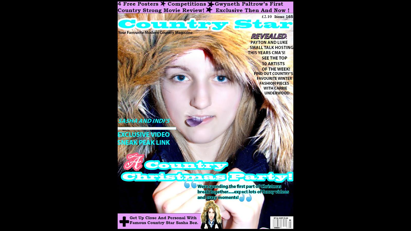
- Masthead - I chose the name Country Star because I felt that it gave a great impression of what my magazine was about. Country = country magazine, country music, country artists Star = Great stars of country music, shining above, great, artists that are upcoming and shining in the industry at the moment. I also chose this name because it was most popular on my questionnaire. The colour blue was chosen because it topped on my poll and questionnaire. It also stands out very well making the magazine eye catching and noticeable.
- Skyline - I chose to have a skyline because from my research I learnt that most Country Music magazine have one. The light purple colour was also part of the swatch that topped the poll and questionnaire. I have included in my skyline what the magazine has to offer, this will make the audience want to take advantage of the offers and deals and make them want to see inside the rest of the magazine. I have used words such as 'Free' and 'Exclusive' because these are words that would get people interested and locked onto my magazine.
- Slogan - I have included a slogan in the top left of my magazine to reveal what type of magazine it was and to get people convinced that this is what they wanted to buy. I have used the word 'Your' to make it more personal.
- Anchorage Text - The text explains the winter hood and the guitar plectrum. The plectrum and the hood contrast slightly but I like this as it shows the Winter/Christmas part of the DPS and the Country part of the DPS and the magazine as a whole.
- Price - I have placed the price on the top right of the magazine as I believe this is a reasonable price for my magazine. According the 'z rule' this would be around the second place the eyes look when picking up the magazine, hopefully the audience will see what a great price it is for the magazine quality the would be getting.
- Main Image - Represents who the main part of the magazine is focused on and what is inside the magazine.
- Barcode - The barcode is placed in the bottom right hand corner because according to the 'Z rule' this is the last place the eyes will look. The barcode is important to have on there so the magazine can be bought but it has no importance to the actual magazine.
- Sell Lines - I have included sell lines on my front cover to give insight as to what is inside my magazine, this will help the audience decide on whether this is what they would like to read.
- Puff - My puff is located in the bottom left hand corner but still stands out and provides an insight to an article inside of the magazine. Most puffs are usually shaped in a star or circle however I chose mine as a rectangle as you can occasionally find these on a Country Magazine and I feel it shows the moderness of the magazine.
The layout of my magazine I feel is good because it is not to overcrowded and busy.
No comments:
Post a Comment