1. This is the first step that I took in making my front cover. I chose this as my background image because I after taking feedback onboard that having a background was so much more interesting for the audience than a plain white background. It also was more like the general country magazines this way. I chose the photo it self because it is a typical outdoors country layout that will appeal well to my target audience.
2. The next step I took was placing the skyline on the top of the page. I placed in the skyline special offers and attention grabbers such as 'free posters' to entice people to buy my magazine and want to read further inside. I also added the Masthead of my magazine because I had 100% decided on my magazine name from personal liking and results of my questionnaire and I knew what I wanted it to look like. I chose the colour blue because it was a popular choice in my questionnaire and poll. I placed where I wanted there to be text and left this subject to change.
3. I chose to keep the text boxes in the same place because I liked the look of the layout this way.I then proceeded to add on where I wanted to place my anchorage text & quote text.
4. I then continued to add to my layout. I added some more sell lines and two spaces for images.
5. I then completed filling in my sell lines, anchorage text and images. I also added a puff to promote a free poster inside the magazine. I placed the puff in the top right because this is one of the first places your eyes look on a magazine according to the 'z rule' I then placed my barcode and price in the bottom right corner because this is the last place your eyes look according to the 'z rule'. I wanted people to have already made up their mind about buying my magazine before seeing the price.
6. I brightened up my background added my artists to my front cover to draw interest and make people want to see inside the magazine to see what their favorite artists have to say.
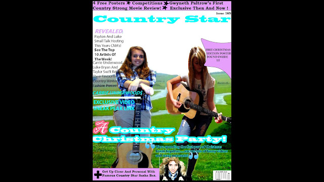
7. This is my finished version of my front cover. I have included all the main magazine conventions:
- A masthead
- Skyline
- Slogan
- Anchorage Text
- Price
- Main Image
- Bar Code
- Sell Lines
- Puff
- Colour Scheme
I have also included a colour swatch that was voted most popular on my magazine questionnaire and poll. I chose it for this reason because I then know that it is a colour scheme that my audience would like. I found my target audience to be both male and female gender aged 14+ going up to around 40 years old. I feel the colours in my colour swatch provide something for everyone.
The layout of my magazine I feel is professional and not too overcrowded. Everything can be seen clearly and is located in places that will catch the eye according to the 'z rule'.
One problem I have encountered is that my images appear slightly blurry after uploading them so I hope to find a way to fix this.
I had considered other images such as this one:
The layout of my magazine I feel is professional and not too overcrowded. Everything can be seen clearly and is located in places that will catch the eye according to the 'z rule'.
One problem I have encountered is that my images appear slightly blurry after uploading them so I hope to find a way to fix this.
I decided not to use this because the artists weren't direct therefore not engaging with the audience.


No comments:
Post a Comment